How to create a chart?
Chart is a graph built according to the parameters you specified.
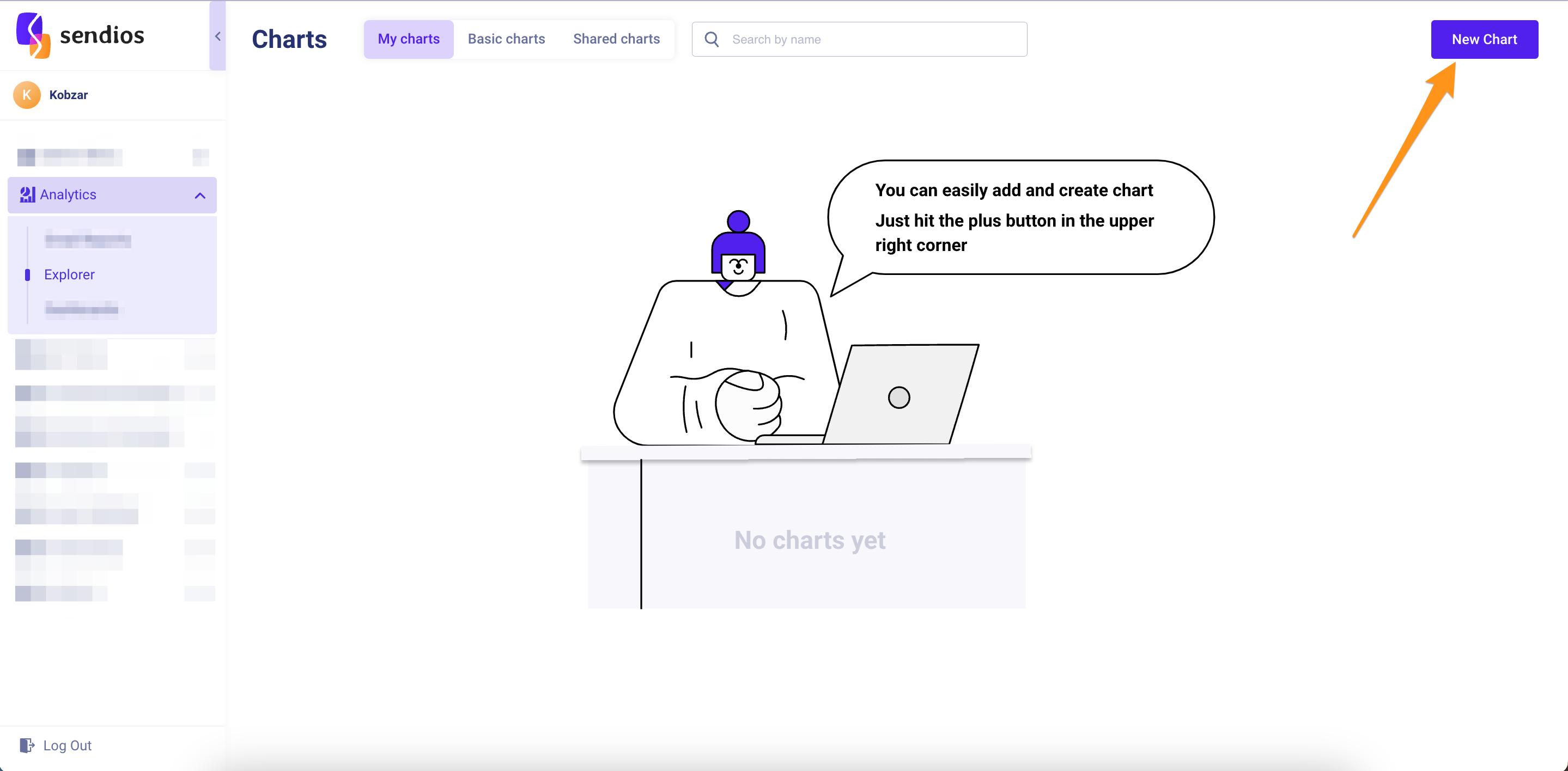
Creating a new chart
- Go to the Analytics → Explorer page and click on New chart.
- In the open modal window, enter a name for the chart in the Name field and optionally add a description of your chart in the Description text field. Then click the Create button.
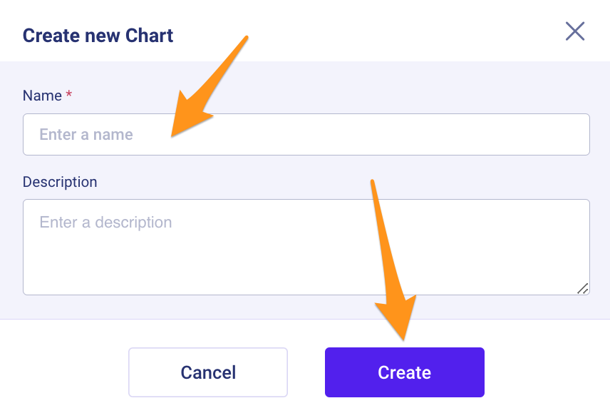
Please note that the charts you create are accessible only to you. In order for other teammates to access your chart, it needs to be shared.
Building graphs
On the chart page, use metrics, filters, and other options to build the desired graphs.
Metrics represents quantitative indicators.
Filters allow you to limit metrics by various parameters.
Separate charts by – provides a way to disaggregate metrics by various parameters.
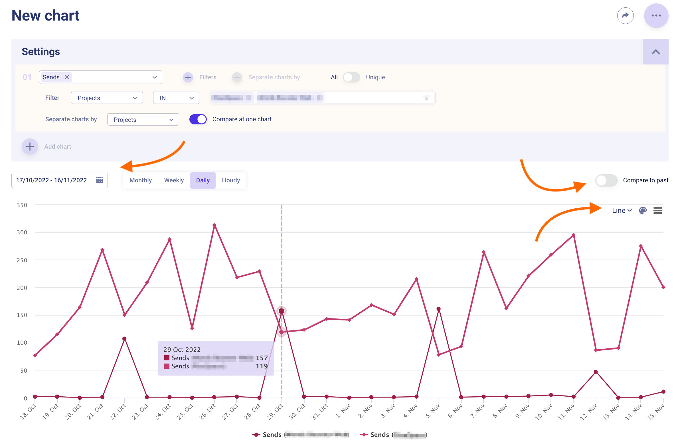
The chart presents real-time information.
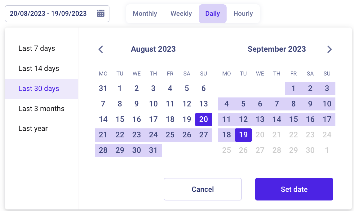
- By default, the chart is built on a daily basis over the last 30 days. You can change the period by clicking on the calendar icon in the top left corner of the graph. In the opened window, you can select a new period or specify a custom one.
- The Compare to past option automatically builds an additional graph for the same period of the previous year. It is always displayed in gray.
- The chart settings are located in the top right corner of the graph. Here you can change the chart type, color, etc.
- By clicking on the three dots, you can:
- Save – save the changes made to the chart;
- Save as new – save the chart as a new one. You will need to enter a name for the new chart;
- Rename – change the name of the chart. A window will open where you can enter a new name and description for the chart;
- Delete – delete the chart. After deletion, you will be directed to the page with all of your charts.
Please note that the charts used in the dashboard cannot be deleted.
Remember to save the chart after making changes. To do so, click on three dots → Save.
Updated over 2 years ago
Did this page help you?